데이터 전처리 실습
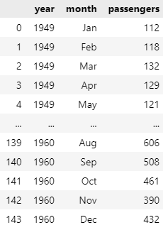
iris 데이터셋을 활용해서 전처리를 해보자
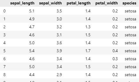
Q1. 'species' 열 값이 'setosa'인 데이터 선택하기
#
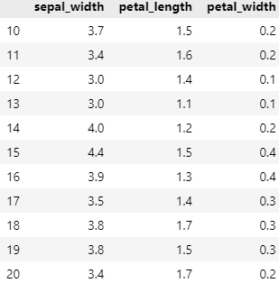
Q2. 10부터 20까지의 행과 1부터 3까지의 열 선택하기
#
tips 데이터셋을 활용해서 전처리를 해보자
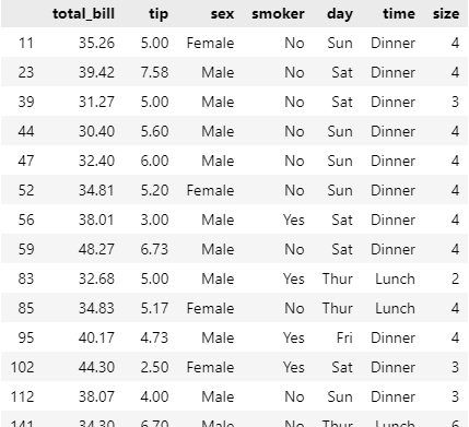
Q1. total_bill이 30 이상인 데이터만 선택하기
#
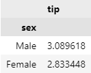
Q2. 성별('sex')을 기준으로 데이터 그룹화하여 팁(tip)의 평균 계산
#
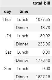
Q3. 'day'와 'time'을 기준으로 데이터 그룹화하여 전체 지불 금액(total_bill)의 합 계산
#
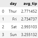
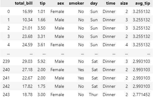
Q4. 'day' 열을 기준으로 각 요일별로 팁(tip)의 평균을 새로운 데이터프레임으로 만든 후, 이를 기존의 tips 데이터셋에 합쳐보자
#
#
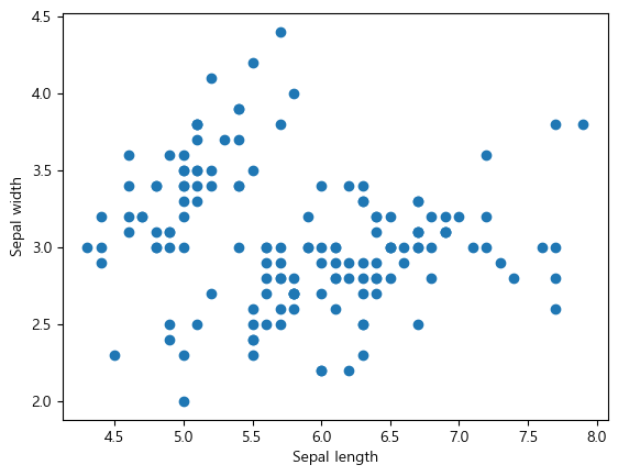
전처리 & 시각화 4주차
데이터 시각화는 의사결정에 도움을 주는 도구
어떠한 행위에 대한 효과와 영향을 인식시키고 설득시킬 때 중요한 역할
기대효과에 대한 시각화된 자료와 함께 분석 결과를 전달하여 큰 설득력을 갖추자
#
#
#

#

#

#
#
#
#
#
#
#
#
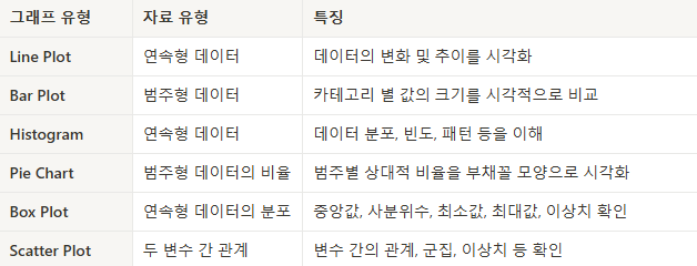
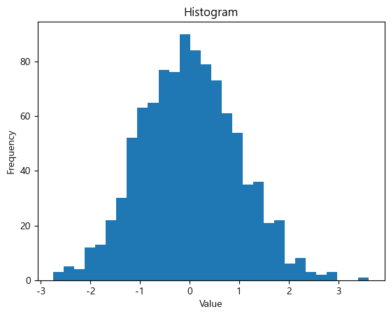
* bins : 구간 나누기
#
#
#
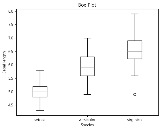
* 박스는 75% ~ 25%
바깥 선은 최댓값, 최솟값
중앙 선은 중앙값
#
#
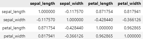
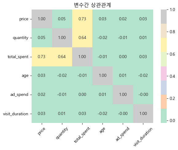
* 데이터들의 상관관계 나타냄
species는 String이기 때문에 corr 사용 불가능, numeric_only를 사용하여 숫자값만 나타냄
동일 글자 한번에 다루기
Ctrl + Shift + L
Ctrl + F2
데이터 시각화 실습 문제
전처리 실습 문제(어제 못푼 것)
3. 중복된 구매 데이터를 확인하고 제거하세요. 중복의 기준은 user_id, purchase_date, product_id가 동일한 행으로 합니다.
#
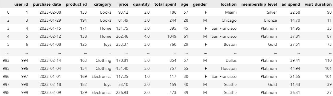
4. price 컬럼에 이상치가 존재합니다. IQR (Interquartile Range) 방법을 사용하여 이상치를 찾아 제거하세요.
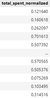
5. total_spent 컬럼을 Min-Max 정규화를 사용하여 0과 1 사이의 값으로 변환하세요.
#
데이터 시각화 문제(전처리 진행한 데이터로 풀었음)
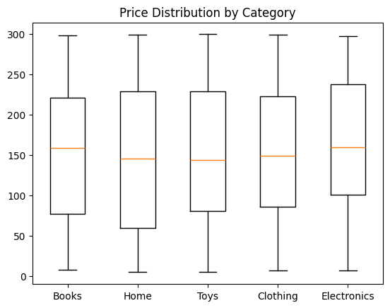
1. price 컬럼에 대해 제품 가격의 분포를 Box Plot으로 시각화하세요. 카테고리별로 그룹화하여 시각화하세요.
#
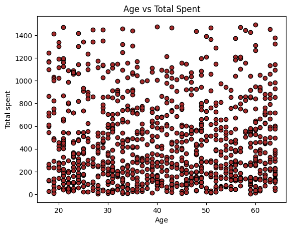
2. age와 total_spent 컬럼을 이용하여 사용자 나이와 총 지출 금액 간의 관계를 Scatter Plot으로 시각화하세요.
#
3. 모든 수치형 데이터 (price, quantity, total_spent, age, ad_spend, visit_duration) 간의 상관관계를 분석하고, heatmap을 사용하여 시각화하세요.
#
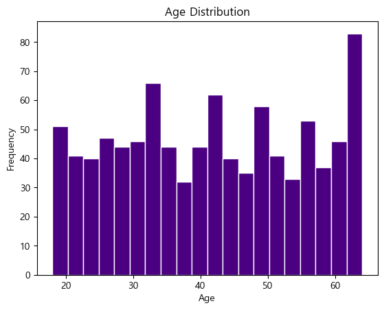
4. age 컬럼에 대한 히스토그램을 작성하여 사용자 나이 분포를 시각화하세요.
#
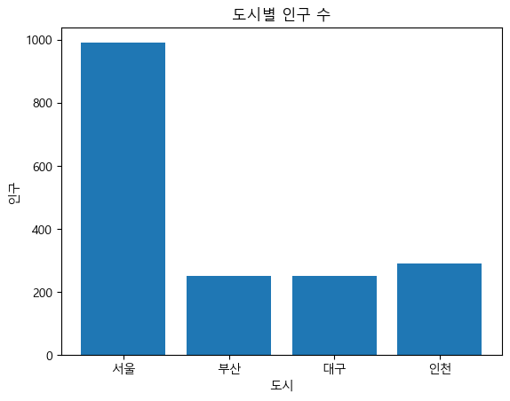
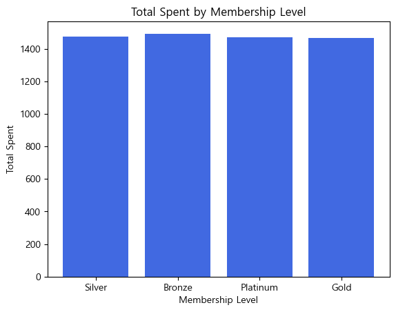
5. membership_level 컬럼을 사용하여 각 회원 등급별 총 지출 금액을 바 차트로 시각화하세요.
#
데이터 리터러시 강의 작성 내용 날아감
코드카타 진행(https://essay2892.tistory.com/40)
데이터 전처리 & 시각화 숙제(https://essay2892.tistory.com/41)
10분 판다스(https://pandas.pydata.org/pandas-docs/stable/user_guide/10min.html)
Stack 이전 내용까지 진행
'TIL(Today I Learned)' 카테고리의 다른 글
| [2025/01/06]내일배움캠프 QA/QC 1기 - 14일차 (0) | 2025.01.06 |
|---|---|
| [2025/01/03]내일배움캠프 QA/QC 1기 - 13일차 (0) | 2025.01.03 |
| [2025/01/01]내일배움캠프 QA/QC 1기 - 자습 (0) | 2025.01.01 |
| [2024/12/31]내일배움캠프 QA/QC 1기 - 11일차 (0) | 2024.12.31 |
| [2024/12/30]내일배움캠프 QA/QC 1기 - 10일차 (0) | 2024.12.30 |